UX
Leading Your First Usability Test
with Heather O’Neill, CEO of Pixels for Humans
Learn how to lead a usability test in order to see how people interact with a product in this tutorial.
Transcript
Leading Your First Usability Test
with Heather O’Neill
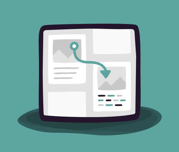
In today’s Take 5 tutorial, you’re going to learn how to lead your first usability test. Usability testing allows us to understand how people move through a digital product to solve a problem or complete a task. Imagine you work at Figma, a collaborative interface design tool. Your user analytics show that despite having the presets for different phones, most users don’t use them when they start a new project. In order to understand why, you set up usability test.
Your first step is to set a research goal or objective, which is the idea or question that you want to understand at a deeper level by performing research. This means you need to ensure that the goal doesn’t assume a solution. It should welcome all possibilities. In this example, our testing goal is to understand why users don’t use mobile presets and uncover what they do instead. Then we choose an audience.
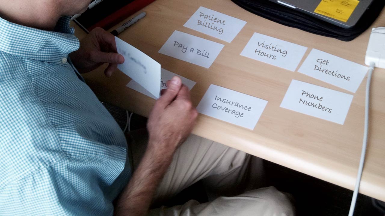
In this test, my chosen audience is UX designers. Instead of choosing a broad audience, it’s important to focus on a particular group. Doing this allows you to better understand the challenges that are unique to them and helps you build more realistic testing scenarios. Once you have a goal and an audience, you can create a list of related tasks. Once we have the test, the third step is to choose the most important ones and turn them into scenarios.
Scenarios allow participants to put themselves into context. For a good usability test, you want about three to five fairly involved scenarios, one per task. Let’s take a look at the create a new project from scratch task. That task leads you to create the following scenario. You just met with your product team to kick off the design of a new mobile messaging app and walk them through the use cases.
You want to start sketching your initial ideas before you lose them. Open Figma and get started on this project. It’s not enough to just give them the scenario, so here’s an important Best Practice: Give your test subjects all the assets and information they need in order to succeed.
In our example, this might include items such as the name and logo of the messaging app, a hand drawn sketch that they can use as a model, a text file with sample names that they might need, and clear directions on the specific use case that they are designing for. Even seemingly small details such as providing login information to the software, in this case Figma, should be anticipated and provided to your participant.
Essentially, you need to remove as many barriers as possible to the thing you are trying to test. What you’re trying to avoid is creating ambiguity or distractions that eat up time or your users patience.
Once you’ve got your scenarios written, do a dry run. This way you catch any hiccups or flaws in your scenarios before you bring users in.
Now we’ll watch our usability test dry run on the screen:
Moderator: Do you have any questions about the scenario or what you need to do?
Participant: Nope, I’m good. Google Material Design that looks interesting. Let me see if I can get in there and maybe get some ideas for how to do this. Mm, OK, I’m interested in this. Maybe I can zoom in on some of those components and see what they’re doing.
Moderator: OK, I’m actually going to stop you there and actually have you go back to the home page and try something a little bit different.
Knowing how each scenario is completed is important. As you saw, the participant got distracted and I was able to step in when they got too off course. If I hadn’t known how to complete my scenario, they may have gone on for longer and become increasingly frustrated.
Let’s see what happens next:
Participant: OK, so it’s a mobile messaging app, and so what I want to do is go in and use mobile phone-sized preset screen as my starting point. So let’s create a new file. And, all right, that looks about right for phone size. So what I want to do here is basically just sketch in a rough pass at the UI just to be enough to convey the point.
Moderator: You’ll notice that my participants said that they wanted to start with a mobile preset only to create a mobile-ish sized box instead. This is important because it happens frequently that people say one thing and do another. Always pay attention to what people are doing not just what they’re saying.
That’s the basics of a usability test. Be sure to check out the rest of the series and also check out our entire course catalog at Gymnasium. Take care.