Development
Writing CSS Media Queries For Responsive Design
with Jeremy Osborn, Director of Learning at Aquent Gymnasium
Learn how to add CSS Media Queries in order to get started with responsive web design in this tutorial.
Resources
Project Files
on CodePen
Related Content
- Using the Responsive Viewport Mode in Google Chrome
- How to Activate and Use Responsive Design Mode in Safari
- Using Media Queries by Mozilla
- Using Media Queries for Responsive Design in 2018 by Rachel Andrew
- Media Queries for Common Device Breakpoints by Justin Avery
- Choosing between min-width and max-width media queries by The Haystack
Transcript
Writing CSS Media Queries For Responsive Design
with Jeremy Osborn
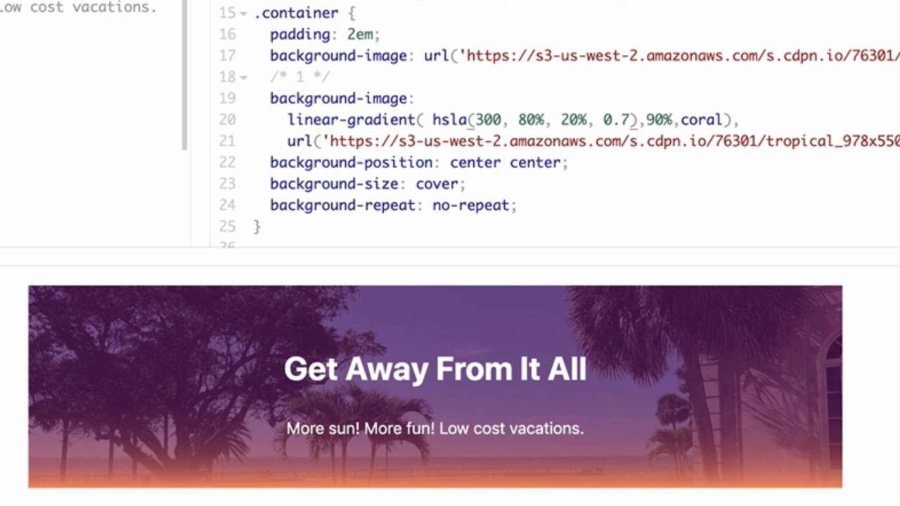
In this tutorial, you’re going to learn how to use CSS media queries in order to change the appearance of your page based on the width of the user’s screen. Now, this is a URL to a project on CodePen that you can follow along with, and that link is also available in the Resources section for this video. You’ll also find a completed version of the project there if you want to check your work.
Now, CSS media queries are special CSS syntax that can detect certain features of a device or browser and then apply specific styles based on that result. Media queries are also a critical element of responsive design, along with fluid grids and flexible images, so learning how to use them is essential for modern websites.
And to help you learn, I invented the Gymnasi-tron 3000, a totally real and not at all fictional machine that translates media query syntax into plain English; so here’s an example:
@media screen and (width: 700px) { … }
Translation: If a screen feature is detected, and the width of the screen is exactly 700 pixels, then use these CSS rules.
And by the way, these CSS styles have to be nested inside the curly braces like so.
And now, you’ll get a chance to put these into your project. I actually wrote the media query for you. All you have to do is add a body style that says 0 margin for the top and bottom and 15% margin for the left and right, like so:
@media screen and (width: 700px) {

  body {
    margin: 0 15%;
  }

}
To see this in action, let’s use the Responsive Mode, a feature most browsers have built in. I’m using Firefox, and so the process looks like this. Save your page in CodePen, change to a Full Page View, then choose Tools > Web Developer > Responsive Design Mode.
Now, type 699 into the width field, and the margins stay the same. When you press your ↑ key once, the margin styles are now applied magically, but if you press the ↑ again to 701, those margin styles disappear. So this demonstrates that your media query is only active at exactly 700 pixels wide, which is great for learning, but almost useless in the real world. A better trick would be to apply those styles when the width was 700 pixels or more. So yes, let me introduce you to min-width, which does exactly that.
@media screen and (min-width: 700px) {

  body {
    margin: 0 15%;
  }

}
Gymnasi-tron says: if the screen feature is detected, and the width of the screen is greater than or equal to 700 pixels, then use these CSS rules. So in your code, go ahead and add that prefix min, like so, save your changes, and back in the Responsive Design mode, if your viewport is still at 701, like mine is, you’re already seeing those margins. So to make it more clear, click an edge of that window, drag it toward the center, note the margins disappear below 700 pixels, but then when you go back the other way, the margins appear when your width is greater than 700 pixels.
Excellent. That’s Big Idea, Number 1: In media queries, min-width means “greater than or equal to.”
Now, let’s look at max-width, which is the opposite. Back in your project, if you change min to max, now when you begin to reduce the width of the browser, as soon as it’s less than 700 pixels, the margin styles are applied.
@media screen and (max-width: 700px) {

  body {
    margin: 0 15%;
  }

}
So just make sure you test this a few times. Look at those with values and make sure you understand. But that’s Big Idea, Number 2: For media queries, max-width means less than or equal to.
Now, you’ll try something a little more advanced. Type min-width: 700px add another and, then change this value from 700 to 1200.
@media screen and (min-width: 700px) and (max-width: 1200px) {

  body  {
    margin: 0 15%;
  }

}
Now, before we look at the results just pause the video for a second and examine this syntax. Can you guess what it’s going to do?
So you can see here, in my Responsive Mode, the window is 585 pixels. As I begin to expand the width to 700, the margins kick in. As I keep expanding, when the width hits 1201, the margins disappear again.
Feeding this into Gymnasi-tron confirms what’s happening. If the screen feature is detected, and the width of the screen is greater than 700 pixels and less than 1,200 pixels, then use these CSS rules. In other words, you’re now testing for a very specific range of conditions. The styles will only be applied when the width is between 700 and 1200.
So I hope you got a sense of how cool media queries are. This is just the beginning. It can also be used to do things like detect when a web page is being printed and then apply custom styles, or detect the orientation or resolution of the screen, and much, much more.
That’s it. I hope this helped, and if you like this video, be sure to check out our other Take 5 videos, as well as the entire course catalog at Gymnasium.